The government's coronavirus data presentation is on the downslide
The government needs to urgently improve how it communicates data
The government needs to urgently improve how it communicates data, argues Gavin Freeguard
A government press conference announcing a second national lockdown in England was a surprise addition to the Saturday television schedule this weekend, (eventually) sandwiched between the Six Nations and Strictly.
It started with a slideshow, the purpose of which was to show how fast Covid-19 cases were rising and what would happen if the rate didn’t fall. But the presentation, led by the government’s chief scientific adviser Patrick Vallance and its chief medical officer Chris Whitty, was unstructured, ugly (at times) and unclear on what it was trying to get across to the public.
A feature of these conferences, particular confusing for anyone listening rather than watching, has been Whitty’s or Vallance’s request for “the next slide, please,” given Downing Street’s inability to find a slide clicker they could use to move them on themselves. The request from the IfG for those presenting in future is a blunt one: “Better slides, please.”
The government’s message lost clarity as too many charts were shared too quickly
Earlier in the pandemic, statistician David Spiegelhalter criticized the government for ‘number theatre’: a barrage of (often questionable) numbers that confused as much as clarified. At Saturday’s press conference, viewers were hit by a form of ‘chart theatre’, with too many charts in too short a time (16 slides in 12 minutes) making the presentation difficult to follow.
The government would have been better off starting with the most important points it wanted to convey, choosing a more limited selection of charts that made those points, structuring the presentation more clearly and then presenting the supporting evidence.
The charts used by the government were confusing and crowded
One of the biggest problems on Saturday was that, for anyone watching on the BBC at least, most of the charts were cut off in some way, losing titles, labels and data, and making them difficult to read.
But there were other problems. Some of the charts were too cluttered, making them too busy to convey their messages as clearly as they could have done. As we tell everyone who does data training at the Institute, you would not throw letters onto a page and hope they fall in perfectly constructed sentences – the same is true of throwing numbers into a chart. You need to think about how it looks – and some of the government’s charts were ugly, with colour choices questionable, and labels and titles unclear or sometimes absent.
Presenters have the advantage of being able to talk an audience through a chart – something both the chief medical officer and the chief scientific adviser did well at times. For example, Chris Whitty described how heatmaps showing coronavirus cases by age and region worked.
And unlike with static visualisations, such as chart in a report, a presenter can – through basic PowerPoint skills – introduce different elements of a chart and talk the audience through what each part means.
Take the slide Sir Patrick Vallance described as ‘complicated’, not something you want a slide to be when it is conveying a message of national importance in a short time on a Saturday evening:
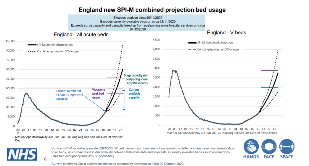
For a start, it would be much less complicated if there were only one chart on the slide. The second chart is not really saying anything different and makes the whole image more cluttered. With just the first chart on the slide, Sir Patrick could have added its different aspects and talked the audience through each one by:
- Showing the chart with the number of occupied acute beds from March to the end of October
- Then introducing the ‘wave one’ peak line and label, and explaining why this matters
- Next, he could have added the ‘current available capacity’ line and label
- Then introduced and discussed the surge capacity line
- Finally, he could have introduced the projection lines – or better still, one line, and explained that it is a combined projection
This approach would help take the audience through the different elements of the chart, and more powerfully present the main point: that bed usage is soon expected to exceed the first wave peak, the current capacity and surge capacity.
Badly presented data will be confusing people inside government too
When we complain about poor quality data published by government, one of our main concerns is what it says about the quality of data inside government – if we are having difficulty making things consistent across (and within) datasets, it suggests those inside government are having similar struggles.
The same concern applies here. If these are the charts that can be pulled together quickly to present to the public, it suggests they are also the ones being used inside government. And if we are having difficulty understanding them, there is no reason to think people inside government aren’t, too. Charts designed to be pored over, analysed and discussed at length by scientists and experts may look different to those designed to communicate messages crisply and clearly, but not everyone working in government is a data expert. Like the viewer at home, the generalist in government should be able to grasp a chart’s meaning quickly.
Communicating data well is a skill. And it has been a vital one during the pandemic. There are some very good examples – think ‘flatten the curve’ at the start of the pandemic, or various news outlets throughout (such as the Financial Times). But this weekend’s slides show that it is a skill that government needs to take more seriously.