Hacking organograms: unlocking government data
Gavin Freeguard argues departmental organograms are a great example of how transparency data can be used to assess Government effectiveness and invite
Gavin Freeguard argues departmental organograms are a great example of how transparency data can be used to assess Government effectiveness and invites you to help us unlock their potential.
In May 2010, David Cameron wrote to government departments asking them to publish an organogram showing a snapshot of their staff - the salaries, grades, roles, professions and units - every six months.
Despite that Prime Ministerial pressure, publication has been patchy:
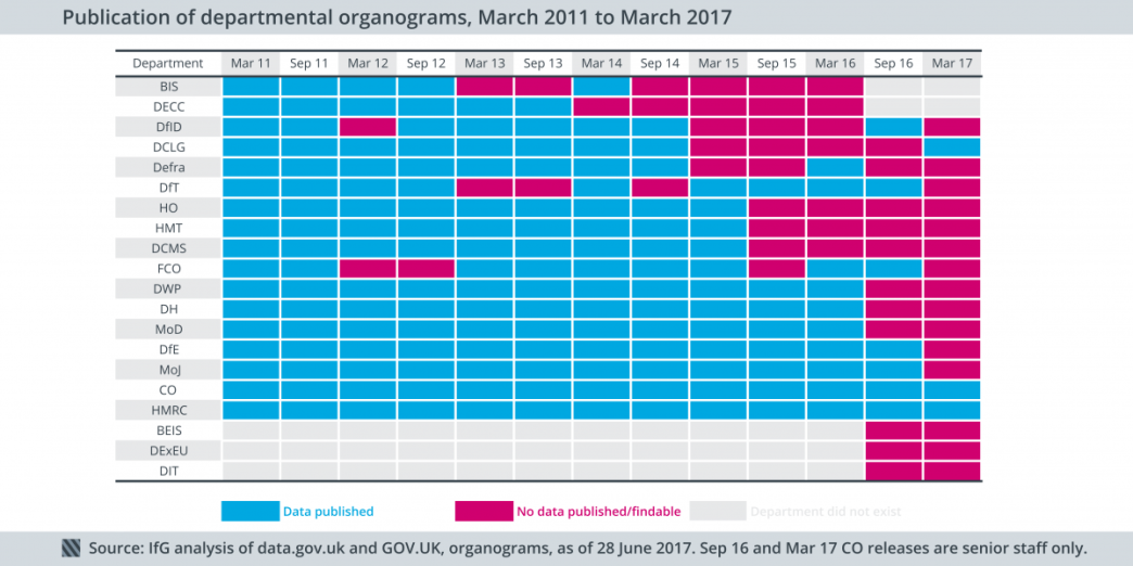
Only two departments – the Cabinet Office and Her Majesty’s Revenue and Customs – have published all the required organograms since March 2011 (and even the two most recent Cabinet Office releases have only provided data on senior staff members).
We’ve heard that one of the main reasons the organograms are not being produced is simply that people don’t see the value in producing them.
This is unfortunate, because there is a great deal of value in visualising and analysing this data.
Transparency: When the political pressure’s gone, can it go on?
Even where they are published, the organograms can be difficult to find. Some are on GOV.UK, others on data.gov.uk, some are part of collections, others on scattered URLs, some appear in interactive versions but don’t have an accompanying spreadsheet and some appear in spreadsheets but don’t appear in the interactive versions.
We’ve not used the organograms much and it doesn’t appear that many others have either - with the exception of the think tank Reform using them to count the number of different grades in each department.
We’ve long assumed that the patchy publication and variation in data quality are a sign that departments themselves are not using the data to inform their own operations. If they were, the data would be of better quality and publication would be a matter of course and not a box-ticking chore.
We’ve heard that organograms can be difficult to produce - though improvements have been made - and that efforts are duplicated in producing similar data for the Office for National Statistics and for other internal purposes along with the organograms.
The tail off in publication suggests that political impetus is not what it was.
The value of visualisation
This is a shame, since there are a lot of benefits in visualising and exploring the available data.
Take the Institute for Government’s famous grade spaceships for instance. Using the organograms, not only can we generate the structure of a department, we can do it for different teams and units within the department, as in this Cabinet Office example:
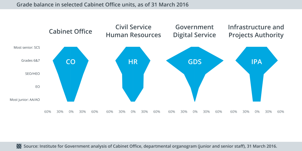
We can see the Government Digital Service (GDS) has a much higher percentage of its staff at more senior grades.
We can look at the professions that Cabinet Office civil servants belong to:
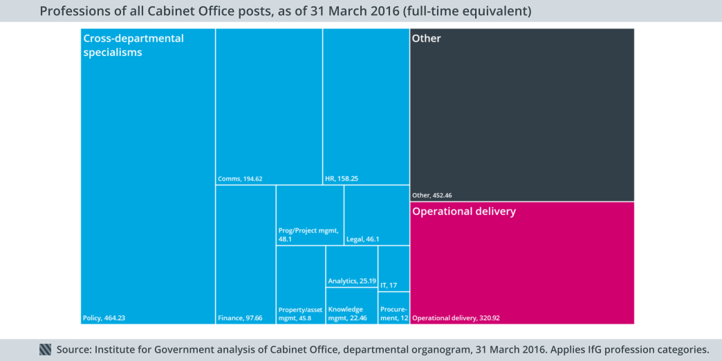
Most Cabinet Office civil servants work on cross-departmental specialisms – mainly policy – although we don’t know what a lot are working on at all (‘Other’).
We can break that down by units, too:
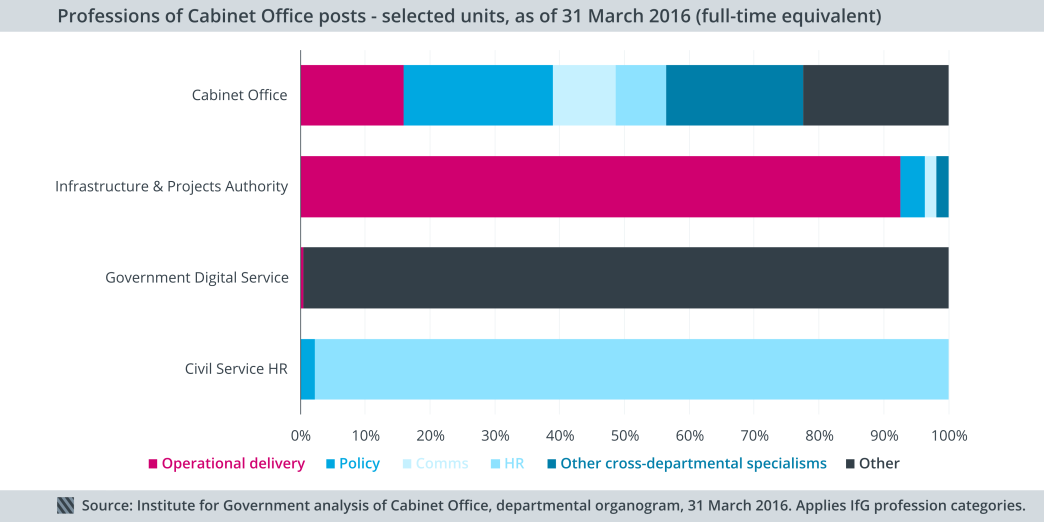
The Infrastructure and Projects Authority has a greater percentage of operational delivery staff than the Cabinet Office as a whole, although it’s not particularly helpful that most civil servants in GDS are classified as ‘Other’. All of this information should be useful to those in charge of these departments, helping them better understand what skills they have and need.
The organograms have other uses too, including mapping which departments and who within them are responsible for particular policies, calculating the tenure and turnover of senior roles and better understanding the composition of the workforce.
Hack for good
The Institute for Government is hosting a hackday on Friday 28 July to unlock the value of the data inside these Government organograms.
We’ve gathered together all the publicly available organogram data for major government departments, allowing hackday attendees to visualise and crunch the data to see what can be done.