Staff reductions on the horizon: charting civil service staff numbers
Gavin Freeguard on the challenges of charting multiple government departments.
Gavin Freeguard on the challenges of charting multiple government departments.
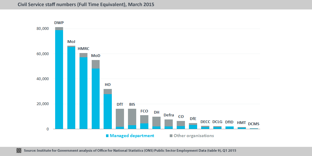
One of the visual challenges we face on Whitehall Monitor is having to chart a large number of departments - at least 16, depending on the data. That's not a problem when taking a snapshot – the size of the civil service workforce in each department in March 2015, for example, is easily dealt with in a bar chart – but it becomes more of a problem when looking at change over time, such as percentage change in staff since 2010. Here's a line chart showing that: 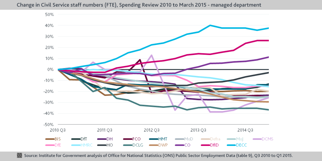
- Both positive (in our case, staff increases) and negative (staff decreases) are charted on the same axis, and are distinguished by colour.
- Once you hit a certain interval, you essentially overlay another series - the line/area starts from the 0% again but with a darker shade of the colour. In our example below, the interval is 10% - so a data point of 15% would be completely full of the lightest shade with the original series (0% to 10%), and half full of a darker shade with the new 10-20% series (which is what happens to the Home Office about halfway through the parliament, below).
In theory, then, you can read off the results from the shape and colour of the charts, with colour being more intense at the extremes (higher increases and higher decreases). 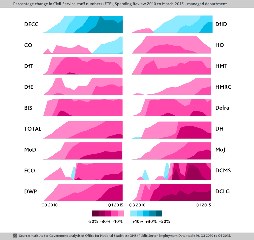
- It looks cool. It's eye catching and draws people in.
- More visual space is given to the data than in the small multiples.
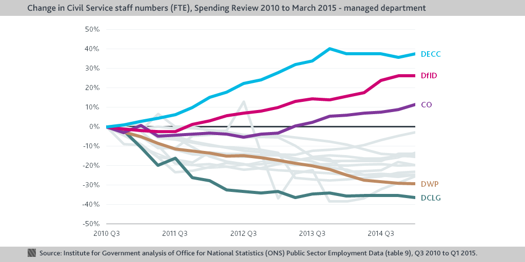
- Once you've got your head around them, you can read off some interesting trends - for example, DECC saw consistent increases until a slight drop recently, DWP has seen consistent decreases, HO is approaching Q3 2010 levels after hitting around -15%, DCMS was all over the place.
The disadvantages:
- It's difficult to read off exact values.
- It's so unconventional that it does take a while to get your head around.
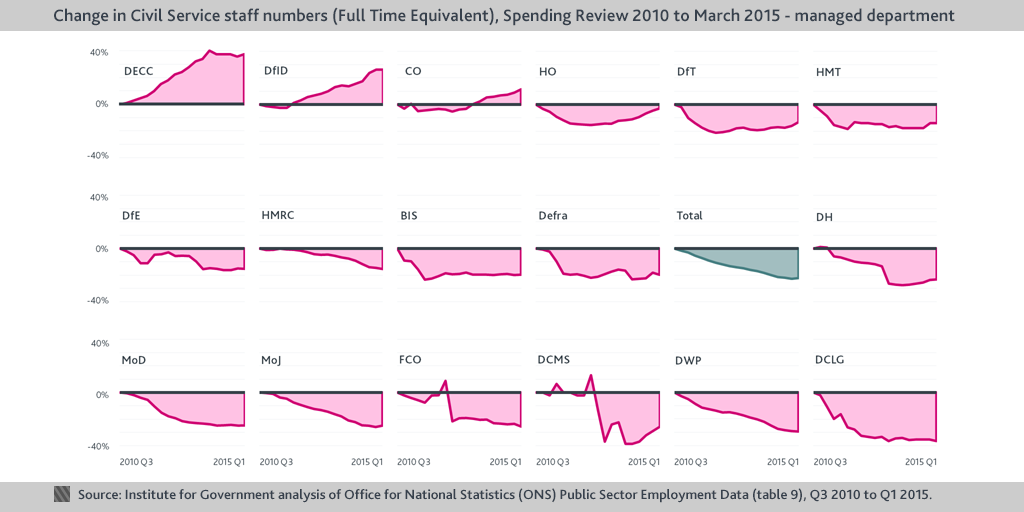
One of George Orwell’s six golden rules for writing was to avoid cliché. Data visualisation often benefits from the opposite – conventional presentations, such as bar or line charts, are easily understood. But there are exceptions, and using an unconventional and arresting chart can make most subjects engaging (see our most retweeted and award-winning graphic on grade structures within Whitehall departments, for instance). But that is predicated on the graphic being readable. As attractive as they look, they are not the most intuitive way of displaying the data. We'll be sticking to our small multiples and coloured spaghetti for now – but we’d be interested to know what you think after scanning these horizons.